Collaborations
Work that leaves the canvas and the wall, and lands on another surface.
NERATTA
Fashion collaboration · 2024
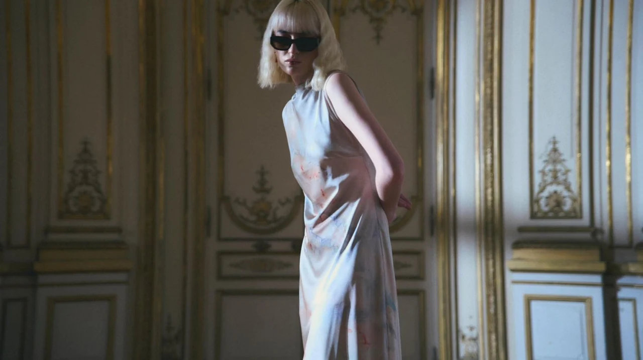
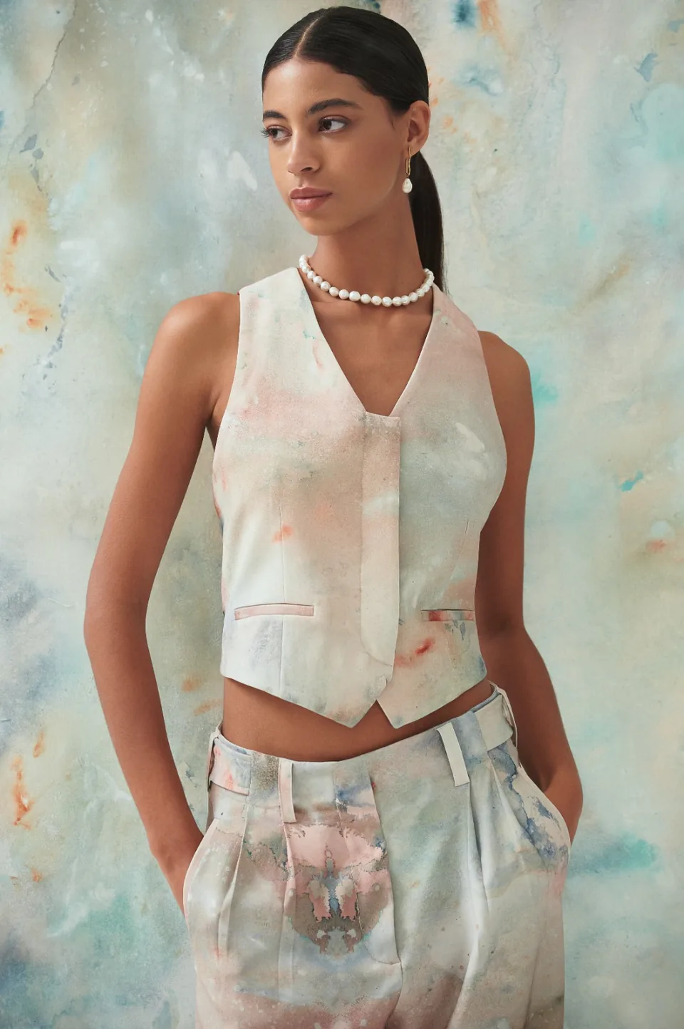
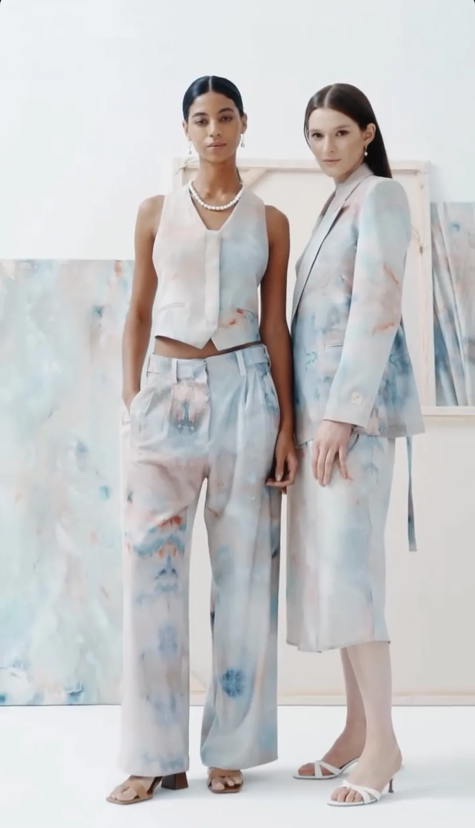
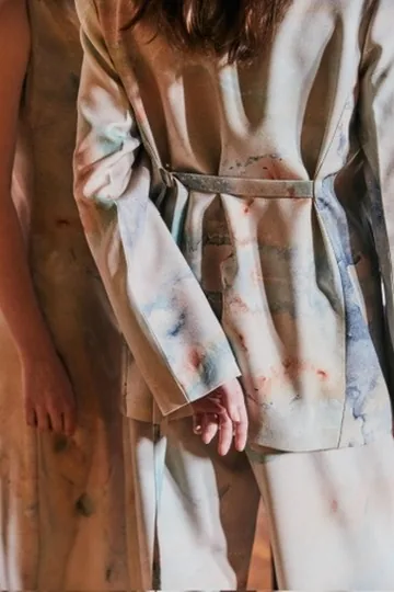
A capsule collection with NERATTA, the Buenos Aires womenswear label. Belén's paintings were adapted and printed onto silk and tailoring — the same atmospheric washes that appear on a wall, translated to cloth and photographed in period interiors.
Role
Painting, colour direction and artwork adaptation for print.
GLOBANT
Corporate mural · Buenos Aires
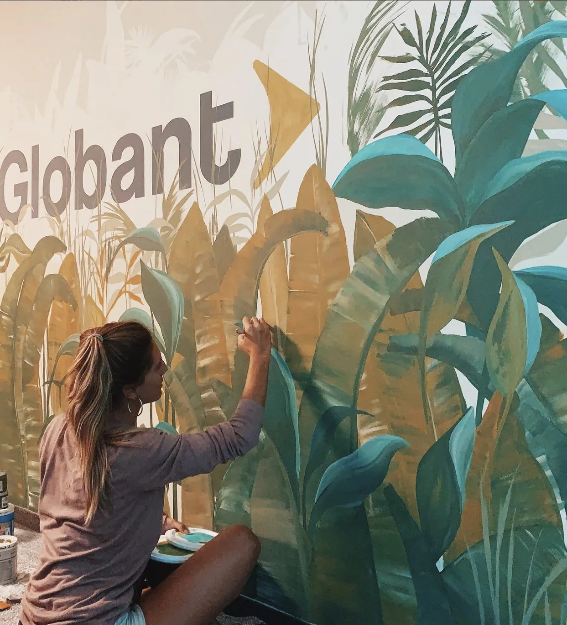
A hand-painted botanical mural for Globant’s offices. The brief was a wall that did not look decorated: the company’s mark had to sit inside the vegetation rather than on top of it. Bananas, palms and grasses were built in layers, from the pale dry tones at the back to the saturated greens at the front, so the logo reads as a clearing in the foliage.
In this image
Belén works seated at the foot of the wall, brush loaded, pushing colour into the edge of a banana frond. The mural is built in three planes: pale dry grasses at the back, ochre fronds arching through the middle, and saturated teal foliage crowding the front. Globant’s wordmark sits behind the vegetation rather than on top of it, and the arrow of the mark reads as one more leaf catching the light. Tins and a loaded palette rest on the floor beside her — the wall is still wet.
Role
Design, colour direction and on-site execution.
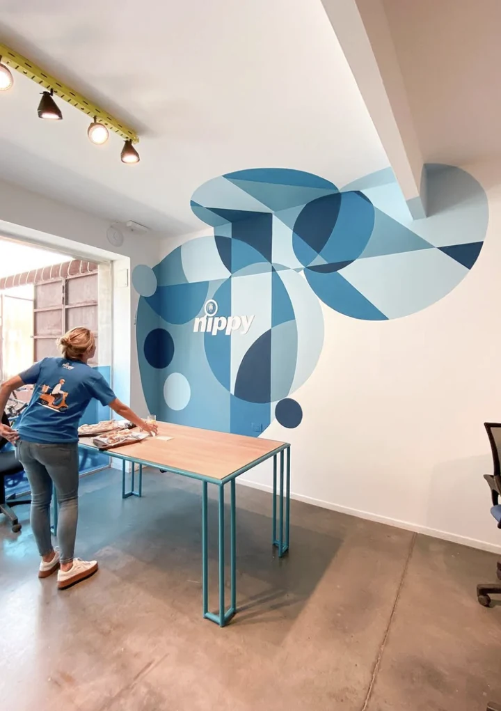
NIPPY
Corporate mural · Office interior
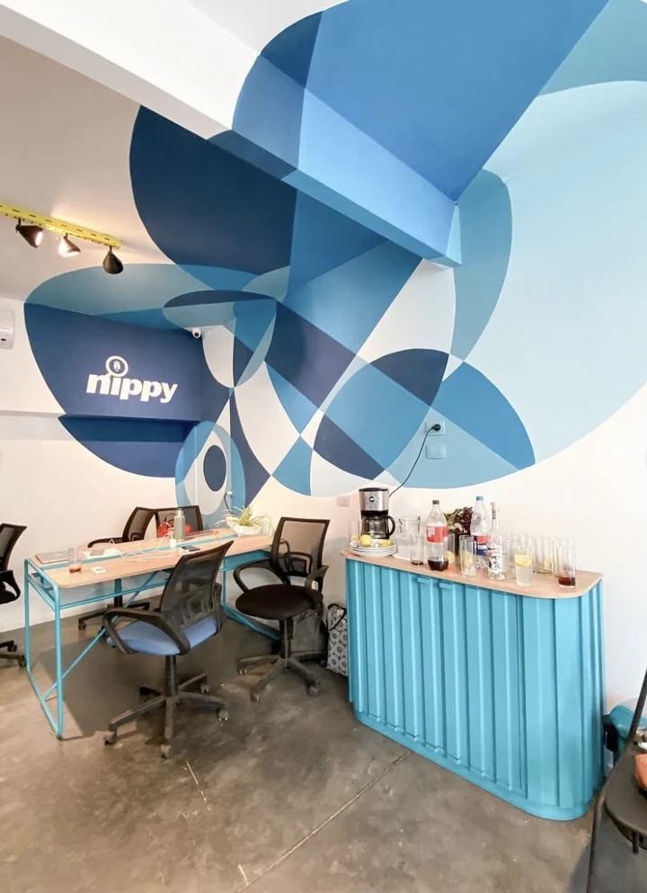
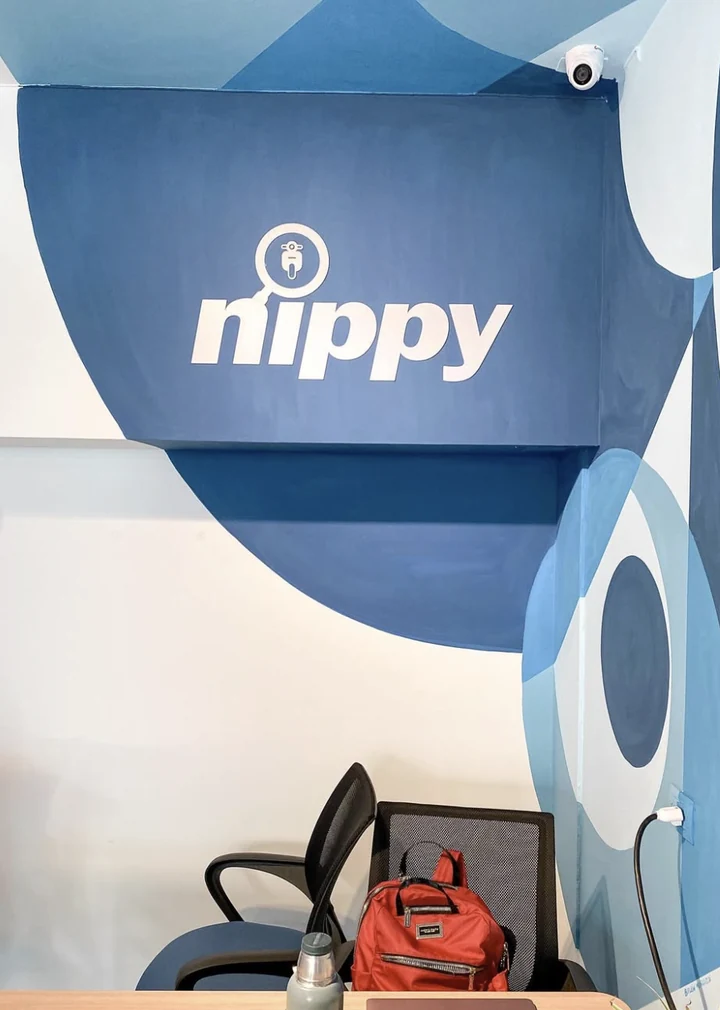
A geometric mural for the offices of Nippy, the Argentine platform that connects migrant delivery riders with work, benefits and training. The brief was a workspace that felt like the brand without becoming a poster: the identity had to be built out of shape and colour rather than applied as a graphic.
In this image
Overlapping circles in a range of blues, cut by straight edges so each intersection reads as a different tone. The geometry does not stop at the wall — it climbs the soffit, turns the corner and wraps the underside of the beam, so the room reads as a single continuous surface. The wordmark sits inside the darkest field, painted at the scale of the wall rather than reproduced as a logo.
Role
Design, colour direction and on-site execution.
ALUNORTE
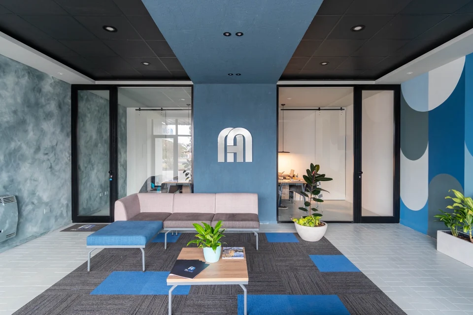
Colour direction · Reception and offices
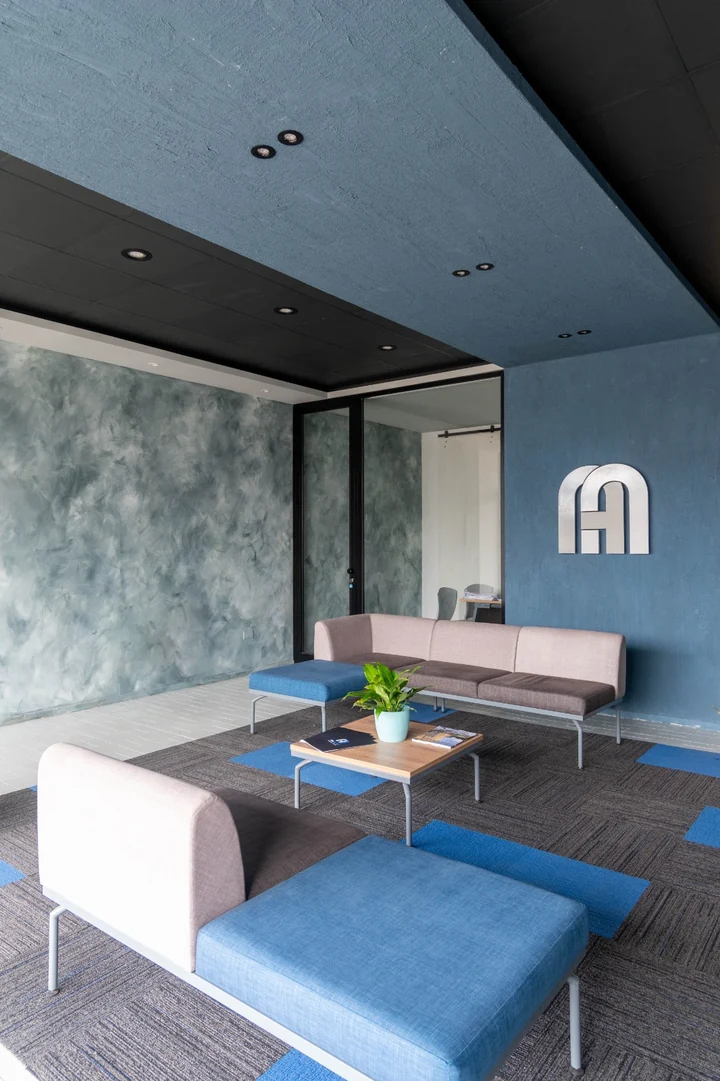
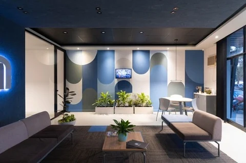
Colour and wall treatment for Alunorte’s reception. The work was not a mural dropped onto a finished interior: the palette, the finishes and the painted geometry were resolved together with the architecture, so the colour explains the plan rather than decorating it.
In this image
A blue plane crosses the black ceiling and folds down the wall behind the seating, turning a flat ceiling into a volume that marks where the waiting area begins. The wall on the left is worked in a troweled green-grey glaze, so the light moves across it instead of sitting flat. The far wall is built from vertical bands closed with half-circles — the same arch as the company monogram, repeated at the scale of a room.
Role
Colour direction, wall finishes and painted geometry.